Communicate progress of a project to management or to the board.
Clear, Concise Communications for Healthcare
Communicating health information that is accurate, up-to-date, and able to be understood by the intended audience has always been challenging.
Health Promotion with a Punch
We work with you to help distil the important elements of your health-related messaging into key points.
After that we turn them into a sketch video that not only piques the interest of your audience, but more importantly cuts through to deliver the message in a clear and concise manner.

The challenges of health communication
Our years of experience working with clients in the healthcare space has taught us that there are a number of challenges when creating an explainer video that actually works.
These include:

Communicating public health information, or encouraging behaviour change that is unpopular but in society’s best interest

Getting messages to an audience from a culturally and linguistically diverse (CALD) background

Competing with “Doctor Google” or contradictory advice that has been sourced online

Presenting data or numbers, such as those presented in an academic paper or study

Communicating emotionally triggering information in a way that is sensitive but not sugar-coated

Communicating instructional procedures for which live footage which is difficult to obtain
Communicating advice contains a number of steps, and is therefore potentially difficult to absorb
Get help, with a Sketch Video
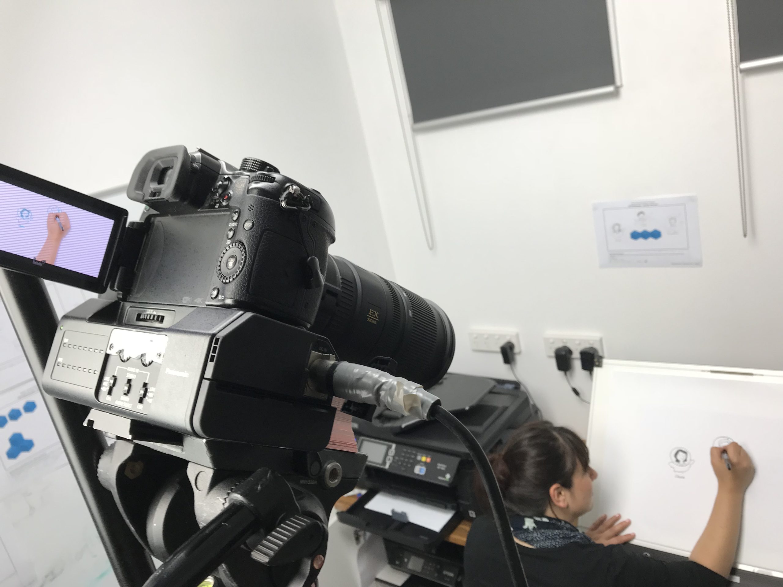
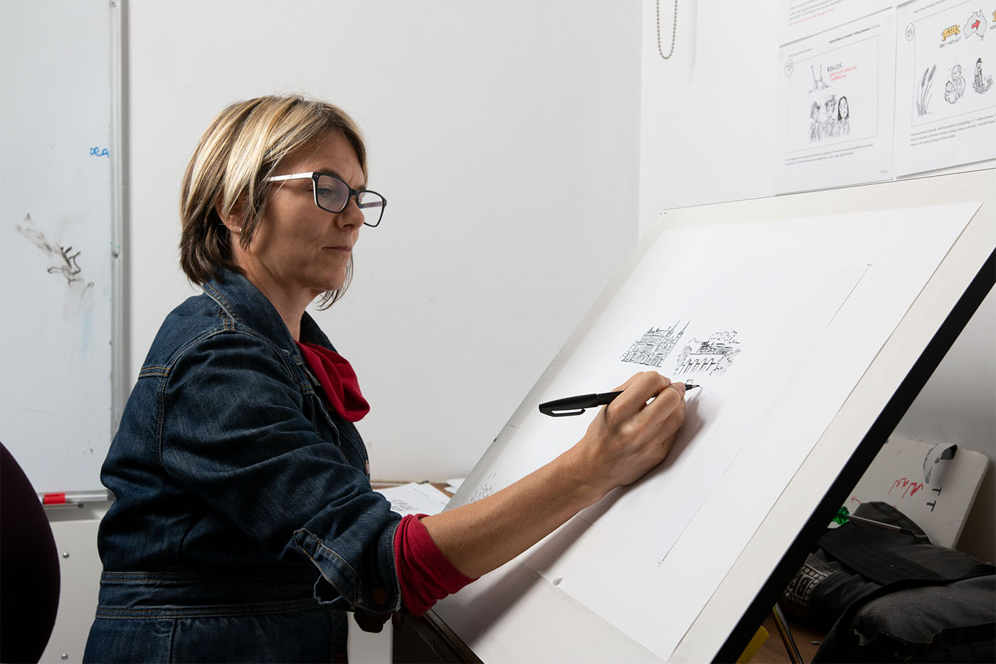
Everyone loves watching someone draw. The loose, organic aesthetic of a sketch can soften data, humanise difficult concepts, and invite the viewer to dig deeper and pay attention to the story we are telling.
5 key advantages of visual storytelling
- Images can bridge literacy barriers by showing rather than telling.
- Data and numbers can be made relatable and easier to understand.
- Sensitive information can be displayed in a way that is delicate and less triggering and less expensive than live footage involving actors.
- Procedures that are hard to film or hard to watch can be presented in a way that is simplified and more palatable.
- Key steps can be grouped, folded into a mnemonic device, or arranged spatially on the page in a way that encourages behaviour change and is easier to remember.
Using sketches in a healthcare context
-

-

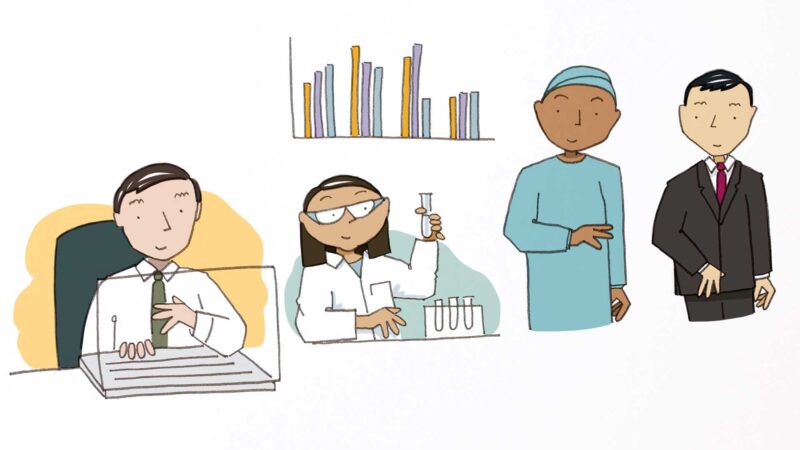
Summarise the role that a group plays as part of a larger ecosystem.
-

Make an academic study more accessible to a wider audience.
-

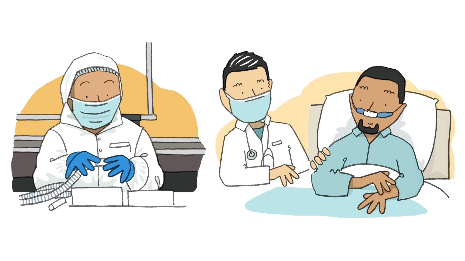
Announcements or instructions on how to stay safe (e.g. from CoVid-19).
-

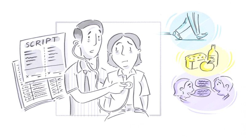
Educate patients on how to care for themselves and their loved ones.
-

Giving instructions to practitioners on how to use a medical instrument.
-

Help refugees or immigrants get the most out of a visit to their GP.
-

Describe a process to follow when interacting with a health provider.
-

Empowering people with mental health challenges to get help.
-

Inspiring professionals and the public about new research findings.
What our customers say
-
Alyson Portlock Mercer
Our business is so complex, I actually can’t believe Lucinda was able to do what she did with the amount of briefing we gave her. She took instruction incredibly well, worked professionally and constructively with our CEO and delivered an amazing result. I am so impressed! She was also lovely to deal with and very friendly. I can’t recommend you guys enough!
-
Louise Payne Child & Youth Area Partnership, London
Matt managed to capture the key points of discussions and agreements perfectly. His presence blended very well with the facilitation process. His illustrations are high quality and engaging and respectful while adding a kind of light-hearted aspect (to some very serious work).
-
Marcail Arbuthnot McKinsey
Debbie captured the core themes we were discussing in a fun, engaging style. Her presence added some theatre to our event and brought a great personal style and attitude. She very effectively surfaced the key themes, was able to quickly identify the important messages and present them in a visually impactful style.
Services that we offer Healthcare clients
-
Learn more

Explainer Videos
We bring your story, idea, or message to life with an engaging, hand-drawn video.
-
Learn more
Graphic Recording
Having someone in the room capture the conversation in real time fundamentally changes the dynamic, and the insights you can gather.
-
Learn more
Illustration
We love bringing health messaging to life with thoughtful imagery, whether it’s explaining the service or inspiring the team.
-
Learn more

Training
Our visual thinking workshops have transformed how organisations think, communicate, and collaborate with each other.
Case Studies
Want to find out more? Read one of our case studies.
Black Dog Institute: Bringing Research To Life
The problem faced by PhD candidate Joe Tighe and his project team is one that many researchers face: how to communicate the results of a study so others not close to the project can understand.
The Big Issue: Explaining a Complex Idea
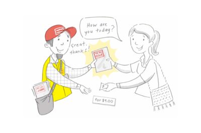
The Big Issue wanted a way to communicate their unique model of helping disadvantaged people get back on their feet. Vendors liked our sketch so much, we turned it into an animated video.
Foster Care Association of Victoria: Mapping a Delicate Ecosystem
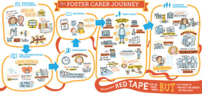
How we helped the Department of Health & Human Services and Foster Care Association of Victoria with the trickiest of communication problems.

