Looking Forward in our Backyard
How we explained a council budget that delivers more than $66.75 million of capital works and $7.54 million in initiatives across a city.

How we explained a council budget that delivers more than $66.75 million of capital works and $7.54 million in initiatives across a city.

How do you make a Budget interesting?
We were engaged by the City of Banyule just a few weeks out from their annual Budget being announced. Council wanted to communicate what the Budget was delivering to the community, and deliver it in a way that was engaging, compelling, but also easier to understand than a written report.
As well as confidentiality being of extreme importance, there was the added challenge of key information not being locked in until 24 hours before the video was due. The Council would only ratify the financial numbers and Budget allocation on the Monday night at their meeting, and the video was to go live on Tuesday.
We were in agreement that a sketch video, with the ability to visualise key funding initiatives, would be well received. Paramount to this decision was the idea that illustration would allow us to show the actual locations where the Budget allocations were making a positive difference to the community.
During production, it became apparent that the imagery created for the video could also be repurposed for other channels, such as the monthly newsletter from Council. In the kick-off workshop, we explored rough sketches of the initiatives that could be visualised, showing the outcome of the funds that were being committed, including:
By depicting these locations through images, we brought to life the vibrant and diverse community of people for whom these facilities were being built, and were able to draw people into a future world in which these projects were realised.

Careful planning and logistics allowed us to create a core video based on expectations for what the Budget figures would be, but allowed options for things to be quickly changed. Give such a tight timeframe, we had our editor and illustrator on stand-by, ready to make last-minute changes as required. The end result was a video where key figures were able to be manipulated in post-production in a timely manner.
An engaging, short video that highlighted what the Budget would deliver to the community, and placed the images for that in the very locations where they would be happening.
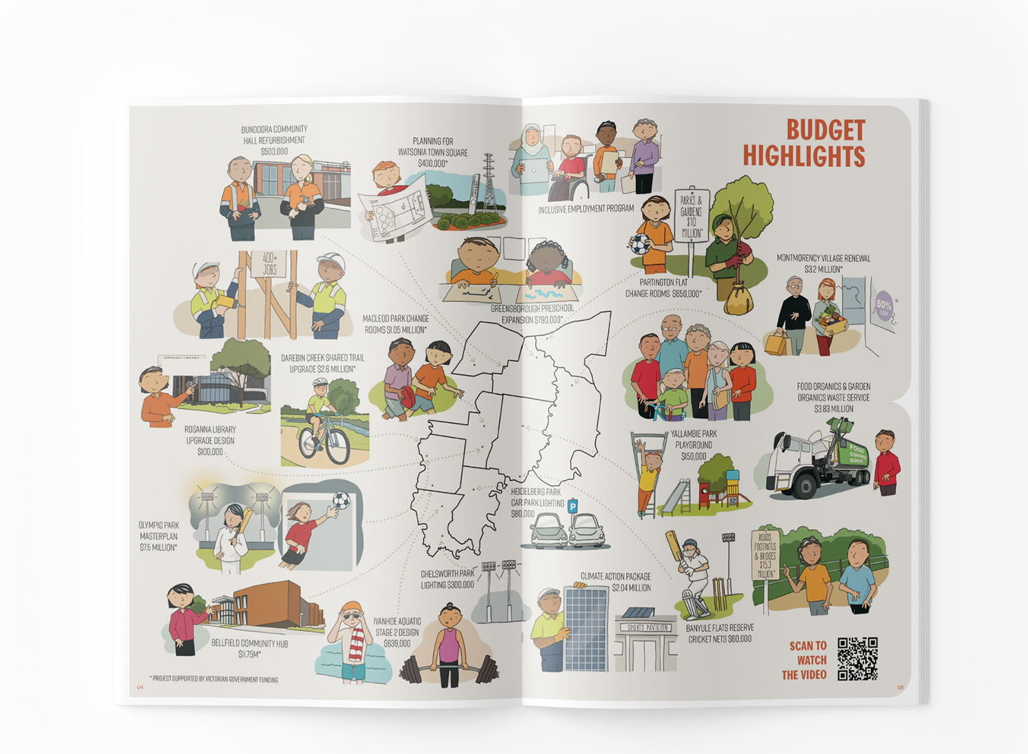
The Banyule Banner, Council’s monthly newsletter, included a two-page spread with imagery from the video that brought each part of the budget to life and helped the clarity that this process brought reach an even wider audience.
As a final touch, embedded in the image was a QR code that directed readers to the video.
Enjoyed reading this case study? You may also like the following:
How we distilled the most important elements of the Australian Government’s 2013 budget into a 3-minute sketch video.
The Big Issue wanted a way to communicate their unique model of helping disadvantaged people get back on their feet. Vendors liked our sketch so much, we turned it into an animated video.
How an award-winning production company that specialises in science and health documentaries created an effective training module for caregivers and medical professionals about deprescribing medication.