
There are a ton of “facts” (complete with precise statistics) that are thrown around about how visual thinking can help us learn—in the classroom or in meetings. But how robust is this data? Here are five of those fun facts that, on the surface make a strong case for visual thinking, but in reality deserve a more critical eye.
🎯 Fact 1: Visuals are processed 60,000 x faster than text
This is probably the most famous of claims about how our brains work when it comes to visuals. Here’s the thing though—this “60,000 x faster” figure is often attributed to 3M (yes, the Post-it Note company). They reportedly used this in a 1997 marketing whitepaper to promote visual aids in presentations. However, that document doesn’t cite any original scientific source, and no peer-reviewed study has ever validated that specific number.
🔭 What Is Backed by Science?
While the exact speed comparison is questionable, there is solid research supporting the general power of visuals in learning and cognition:
- Cognitive Load Theory (Sweller, 1988): Well-designed visuals can reduce cognitive load, helping learners grasp complex ideas more efficiently.
- Dual Coding Theory (Allan Paivio, 1971): Suggests that we process visual and verbal information via separate channels, and combining them improves memory and understanding.
- Picture Superiority Effect: People tend to remember images better than words, particularly when visuals are combined with text.
The verdict: We can’t really put any numbers on it, but it’s definitely true that the human brain processes visuals much faster than text. This means visual thinkers can quickly synthesise complex information and see patterns others might miss!
🧠 Fact 2: 65% of people are visual learners
Another classic statistic that sounds convincing. But how does it hold up?
🧐 What’s the Origin of This Claim?
The stat is often attributed to research by Walter Barbe, who developed the VARK model (Visual, Auditory, Reading/Writing, Kinesthetic) in the 1970s. The number itself, however, seems to have appeared without a clear citation, and it’s been widely questioned in the years since.
📚 What Does the Research Actually Say?
- Learning styles theory, especially VARK, has not held up well under scientific scrutiny.
- Multiple meta-analyses (e.g. Pashler et al., 2008) found no reliable evidence that tailoring teaching methods to a person’s “learning style” improves outcomes.
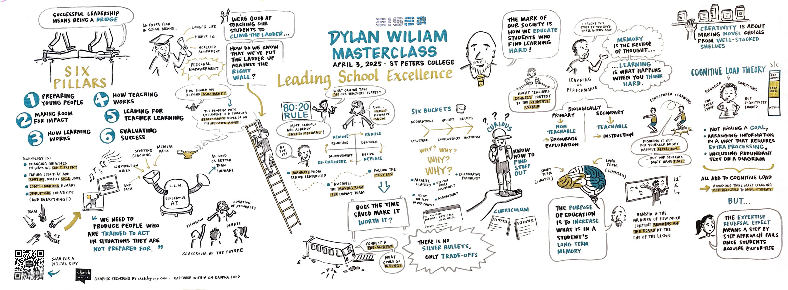
- People may have preferences for how they receive information, but this doesn’t necessarily reflect how they best learn. In fact, leading education researcher Dylan Wiliam suggests that catering to a student’s learning style could actually hinder their learning, by forcing their brain to not work as hard.
- In fact, the modality of the content itself (e.g., visualising a process, hearing tone in music) often dictates the best way to teach it—not the learner’s supposed style.
The verdict: While the idea that 65% of people are ‘visual learners’ is catchy, it oversimplifies how learning works. Research shows that combining visuals with other modalities—especially when aligned with the content—supports deeper understanding for all learners.”
👥 Fact 3: Using visuals increases comprehension by up to 400%
🧐 Where Did This Come From?
Like the “60,000x faster” stat, this 400% boost is commonly cited without a solid source. It’s often attributed to marketing materials or corporate training whitepapers from the 1980s–90s (again, 3M pops up), but no peer-reviewed study seems to back it with robust data.
🧠 What We Do Know About Visuals and Comprehension
While the specific percentage is questionable, there’s strong evidence that visuals can enhance comprehension, especially when:
- They’re relevant and well-aligned with the content
- They clarify complex relationships (e.g. diagrams, charts)
- They reduce cognitive load (Cognitive Load Theory again!)
- They support dual coding (Paivio, 1971), helping learners build connections between verbal and visual information
In short: visuals absolutely help comprehension—but measuring that benefit in a single stat like 400% is oversimplified and likely exaggerated.
The verdict: While the ‘400% increase in comprehension’ figure floats around the internet, it’s not grounded in hard science. What is well supported is that visuals—when used thoughtfully—can significantly boost understanding, especially for complex or abstract concepts.
💬 Fact 4: People are 6x more likely to remember visual information than spoken words
🧐 Where Does This Come From?
This one’s like the others—widely repeated, but hard to trace. It likely stems from general findings about the picture superiority effect, but the “6x more likely” number doesn’t appear in any robust, peer-reviewed study.
📚 The Science Behind It
Here’s what’s actually supported by research:
- The Picture Superiority Effect (Standing, 1973; Paivio, 1971) shows that people remember images better than text or audio alone.
- In a classic study by Standing et al., participants remembered more than 2,000 pictures with over 90% accuracy after several days.
- Visuals are more concrete, easier to encode, and more likely to be stored in long-term memory than spoken words.
But again, there’s no precise “6x” figure that researchers have agreed on—it’s a simplification (and probably an exaggeration).
The verdict: While it’s often claimed that people are six times more likely to remember visuals than spoken words, that number doesn’t come from solid research. What is true is that our brains are wired to retain images more effectively than words alone, thanks to the picture superiority effect.
🤝 Fact 5: Visual collaboration tools improve team performance by 23%
This is another statistic that sounds legit. Right? Well, sort of…
🧐 Where Does This One Come From?
This stat comes from a Forrester Research report commissioned by Mural, the online visual collaboration platform. The 23% figure was based on surveys and interviews with users of the tool, not an independent, peer-reviewed study.
So: it’s based on user feedback, not an experimental study with a control group—useful, but not ironclad.
📚 What the Research Suggests
While hard numbers vary, there is growing evidence and consensus that visual collaboration tools:
- Speed up decision-making
- Improve alignment in hybrid/remote teams
- Encourage engagement and participation, especially when people are solving complex problems
- Support shared mental models, which improves understanding and reduces miscommunication
However, performance boosts depend on how well the tools are used (e.g., are people trained? Is the visual framework well-designed?), not just having the tool itself.
The verdict: While a 23% improvement in team performance is often cited in connection with visual collaboration tools, this stat comes from a commissioned survey, not peer-reviewed science. Still, there’s solid support for the idea that visuals help teams align faster, think more clearly, and collaborate more effectively—especially when working remotely.
What Conclusions Can We Draw?
While some of the stats floating around the internet about visual thinking might be a little too eye-catching to be true, the core idea still holds water: visuals are powerful tools for learning, communication, and collaboration.
Whether it’s helping students grasp abstract ideas, encouraging participation in the classroom, or making concepts stick, visual thinking has earned its place in every educator’s toolkit. Just remember—it’s not about flashy figures, it’s about using visuals with purpose.
So the next time you’re sketching out a concept on the whiteboard or reaching for a visual metaphor to explain something tricky, you can feel confident knowing the science is (mostly!) on your side—even if the numbers need a pinch of salt.